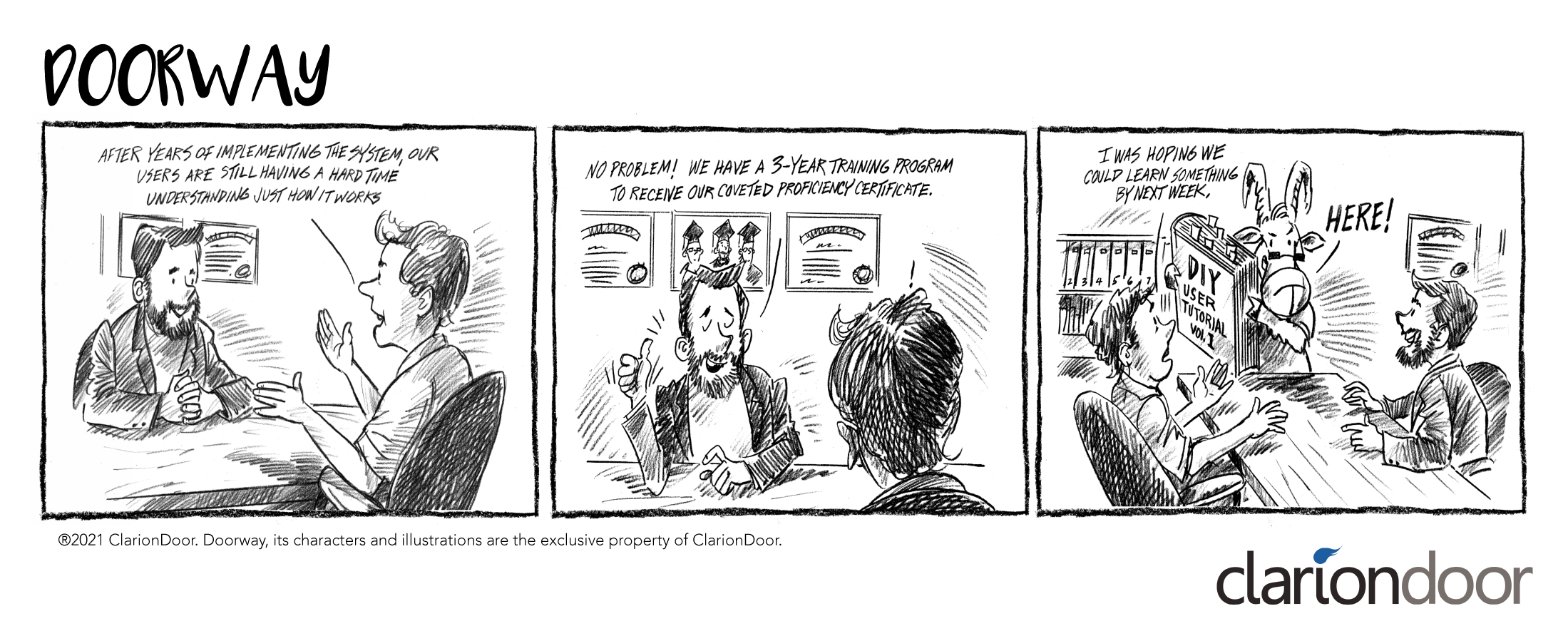
Onboarding team members to a newly implemented system is critical to the success of any insurance company. However, it can also be a very frustrating experience, especially if the vendor requires your team to complete a multi-phased training and certification program in order to use the system. Learning a new system is very important, but there are tell-tale signs that the system you chose is just too complex. Here are our top 3 indicators.
Insurance is a complex industry. Does the user experience need to be just as complex?
Unfortunately, many insurance software systems overlook the user experience, exposing the frontend to the complexities of the backend.
This not only creates a frustrating situation for your team, but also adds expensive training costs which could have been avoided.
The bottom line is that when you invest in a new software system and spend months or years implementing it, the expectation is that it will work and it will be easy to use. The sad truth is that this is not always the case, and worse yet, you may not see the warning signs until you have already invested people, time, and money. Here are some early indicators that can help identify when you might be heading down the wrong path.
1 Vendor Training Program
This is likely the most obvious sign that your team has a long onboarding journey ahead of them. In the past, training and certification programs were perceived as showing the software and vendor’s maturity level. However, insurance technology has evolved so much that perception and expectations on training have shifted – and rightfully so. Today, users expect a more intuitive, user-friendly interface that is as simple as Microsoft Excel.
When your team requires weeks or months of training and needs to be certified, or if there are volumes upon volumes of user documentation, the software is far too complex.

2 Software Design and Architecture
Software design and architecture tends to be the root cause for most extensive training and certification programs. The problem is “over-engineering.” Often, insurance software is designed and developed from a developer’s perspective, rather than a user experience perspective. This results in backend complexities being introduced into the frontend interface. This makes the software very difficult to learn and sacrifices usability.
Insurance solution providers are forced to provide massive, multi-layered training and certification programs to mask the inefficiencies in the user experience. Our suggestion? Ask for the manual before you consider the vendor.
3 Implementation Teams
Another, less obvious, sign is the size of the vendor’s implementation team during your project. Many insurance solution projects, especially for policy administration systems and other core systems, tend to take years to implement and require massive teams. Projects like this are an immediate indicator that the software is complicated and not user-configurable.
If you are experiencing any of these, don’t give up – there’s still hope – and it’s probably time to experience ClarionDoor…
The ClarionDoor Experience
At ClarionDoor, all of our software was designed to reinvent the insurance experience by not only improving and simplifying the architecture, but by delivering an unparalleled user experience that is intuitive.
One of our goals was to remove the need for specialized training or skills. With ClarionDoor, your experience is all you need. You won’t need to learn a new syntax language. You won’t need to keep a flowchart of complex processes on display in your office, and you will never need to code anything.
We have also modernized the training process by incorporating it into our software. Yes, we also do traditional training so you can learn some tips and tricks. But even that only takes a day or two. For those who like certifications, we apologize. There’s no four year degree or the additional prestige of another certificate when you use our software. There’s just the joy of simplicity and the satisfaction of the consistent ClarionDoor experience.
Are you ready for a new experience? Start today with ClarionDoor at [email protected].
Follow us to stay updated with ClarionDoor.

